Give your 404 Error page a personality makeover
Picture this: You’re browsing a website, researching something, and just when you find it and click on it, BANG! – you get a 404 Error message: Page not found. After muttering something along the lines of #@%$! you try to get back to where you’d been before, or you give up and try another site.

If there were a contest for Worst 404 Error Page ever, this would be the hands-down winner.

No visuals. Just dull grey and black. And despite the giant headline saying Page Not Found, they tell you again, directly below. (Did they think we’d missed it?) The only plus: They make a couple of suggestions.

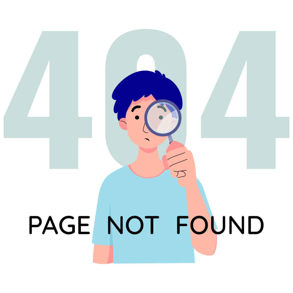
A lot of 404 Error pages use bland & boring clip art. But at least this one says “Sorry” and has a button to take you Home.
But what if that error page had made you smile, or had offered you several helpful suggestions, and encouraged you to stick around?
You’d have given them another chance, wouldn’t you? That’s the power of a well-crafted 404 Error page—especially if it looks like you, sounds like you, and makes people LIKE you.

This library’s page is visually blah, but it sounds like a librarian: helpful, informative–and so polite, it apologizes twice!

This provincial page uses attractive visuals from elsewhere on the site and suggests a couple of remedies – but they take no responsibility for you ending up on this page. Adding “Sorry about that.” after the headline would have been nicer.
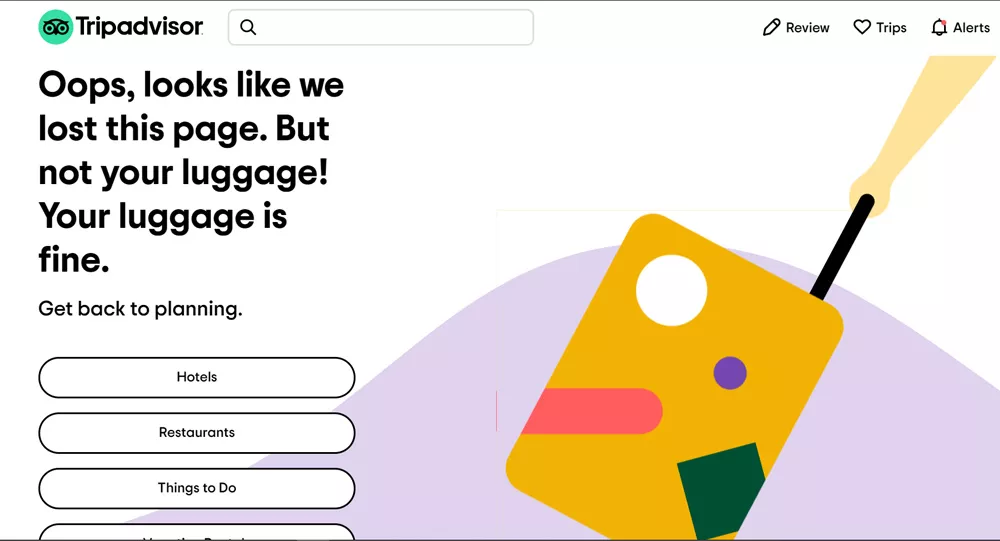
This page is super friendly, uses a whimsical image and playful, humorous copy that’s totally on-brand. It accepts full responsibility for you ending up on this page and gives you several buttons to send you back to what you were looking for.
Why your 404 Error page matters
Keep in mind that when your users get a 404 Error page on your site, it’s because somebody goofed. Maybe you removed the page or just moved it… but forgot to delete or update the link. Maybe your user made a mistake when typing or copying the page’s URL. Regardless, the result is a digital dead end that can discourage them or drive them away.
That’s why you need an error page that turns a bad experience into a good one.
A good error page can:
- Reduce your bounce rate by encouraging users to return to your home page and do a search – or explore pages on your site that you want them to visit. Like these examples:
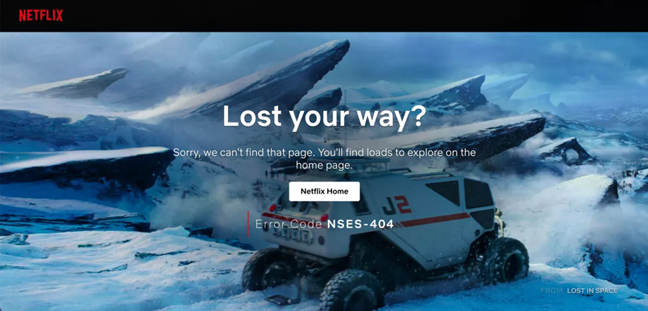
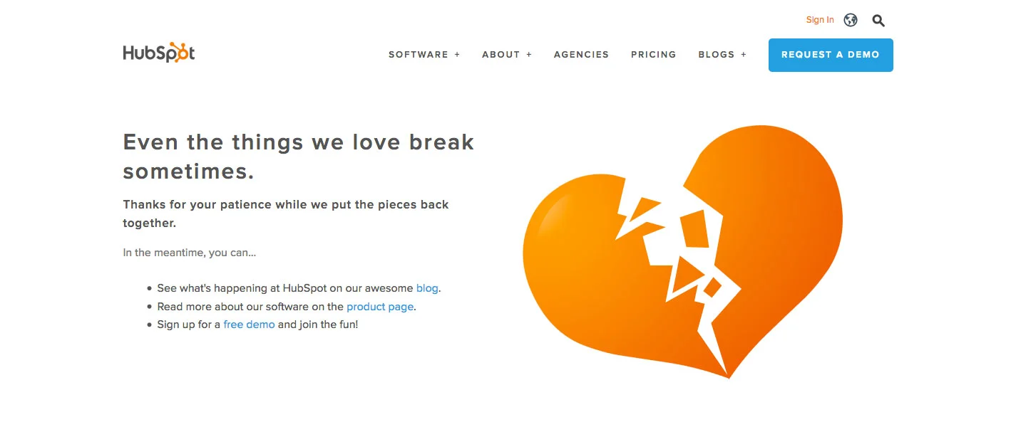
- Enhance the user experience by turning a negative into a positive, either by making your users smile, or by suggesting what may have gone wrong that they can fix at their end.
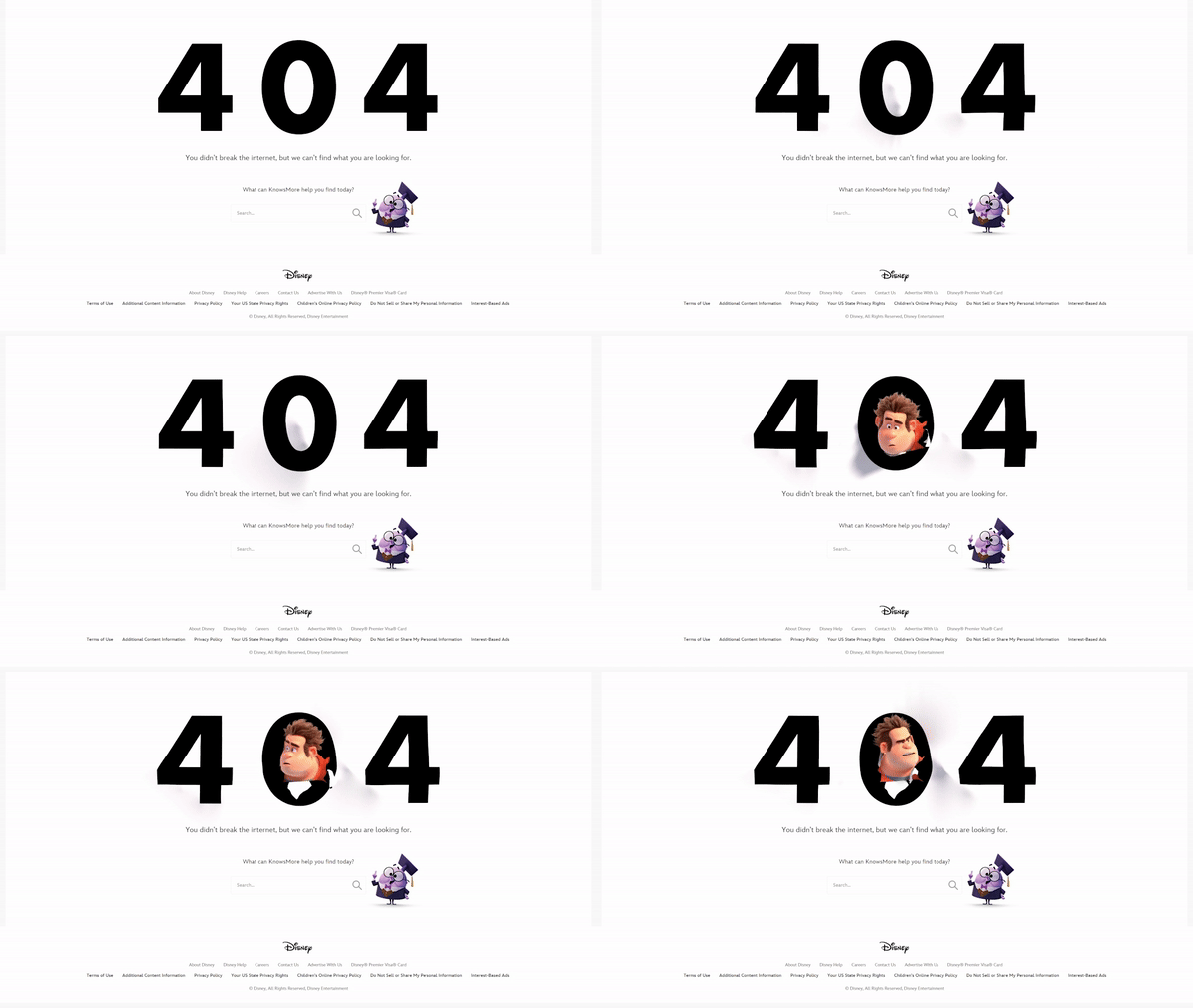
Disney (unsurprisingly) uses an animated page to engage users who end up there. And they don’t make you go to their Home page to do a search. They include a search window right on the page.

It’s hard not to smile when you land on this 404 Error page.
- Project your brand character through its look and tone of voice, reflecting the same personality and attitude that make your brand appealing and unique.
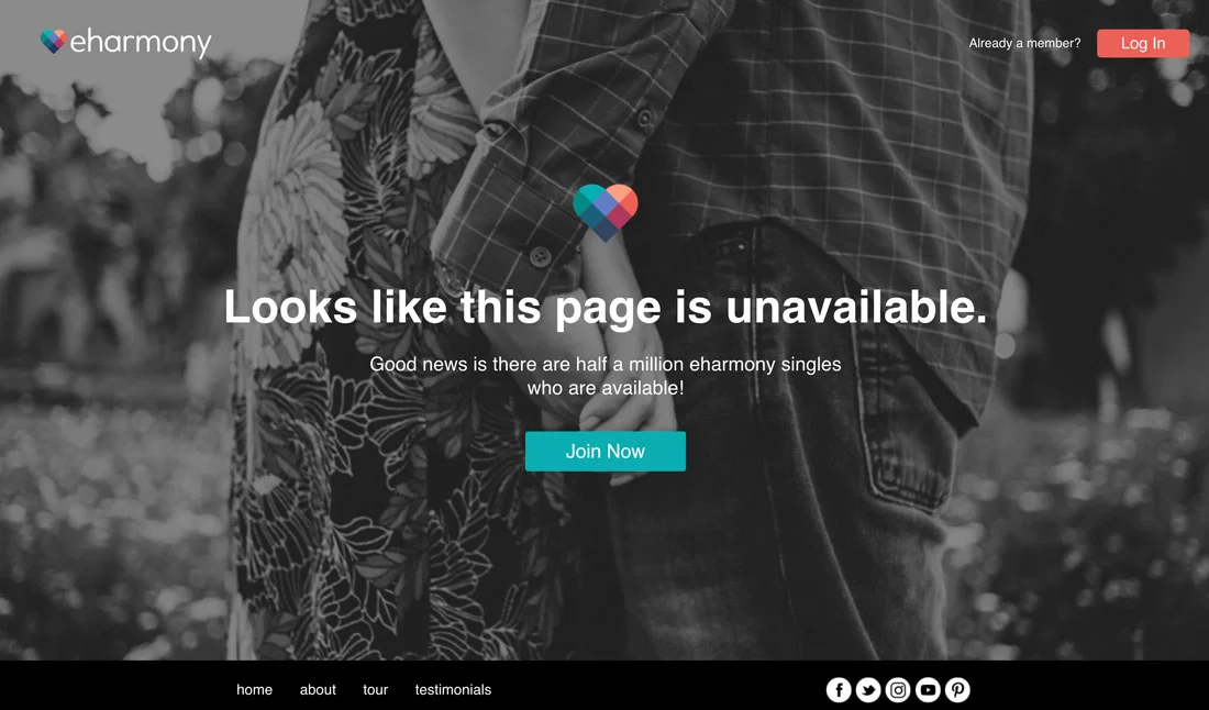
Whoever reaches this page was likely checking out someone who’s left the site or has found someone special, so referring to the lost page as “unavailable” makes sense. So does reminding the user that there are many more potential dates who ARE currently available, encouraging them to return to the site and keep on searching.
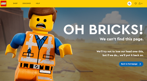
Lego nailed it by using their own distinctive product to speak to the user and put a smile on their face.
How to craft a 404 Error page that suits you
- Use engaging copy
The words on your 404 page are just as important as the design. If you’re a quirky, fun brand, you might say “Oops! We’re lost. Let’s get back on track.” If your brand is more formal, you might say something like, “We’re sorry. It seems that the page you’re looking for has been moved or removed. Please click here to continue browsing our website.”
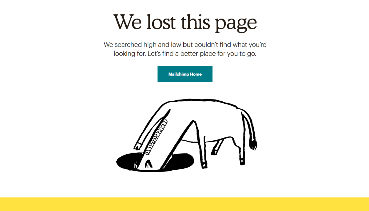
FUN & QUIRKY: Not only does the copy have personality, but the horse is animated (its tail swishes back and forth) and something in the hole keeps lighting up). See: https://mailchimp.com/404
- Incorporate visuals
Use images, illustrations, or even animations that reflect your brand’s aesthetic. A tech company might use sleek, modern graphics, while a children’s toy brand could use colorful, whimsical illustrations.
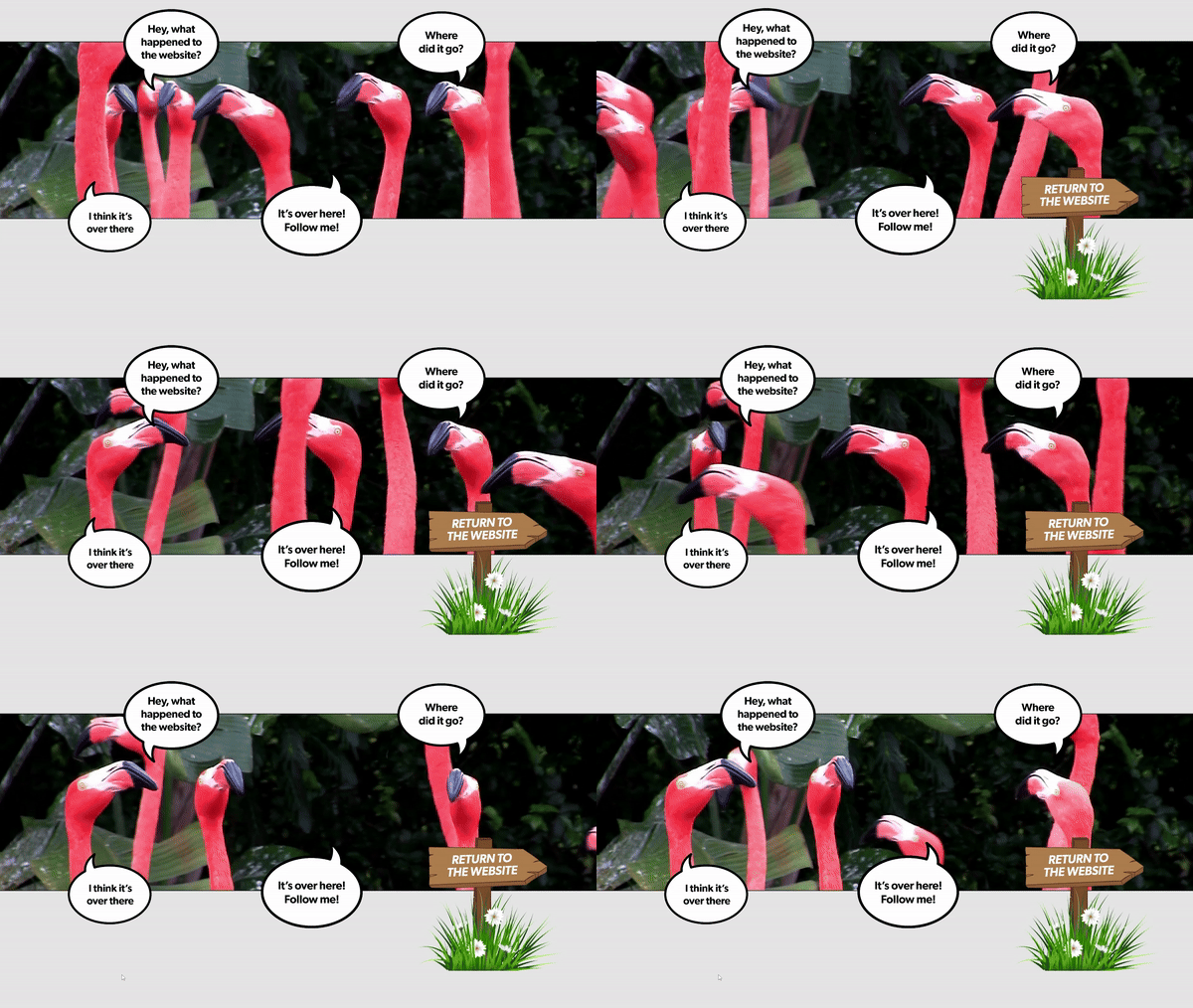
The World Association of Zoos and Aquariums uses a looped video of flustered flamingos that make you laugh. See for yourself at www.waza.org/404
- Offer navigation options
Don’t leave users stranded. Provide links to popular pages, a search bar, or suggestions on where they could go next. This helps keep users on your site, engaged with your content.
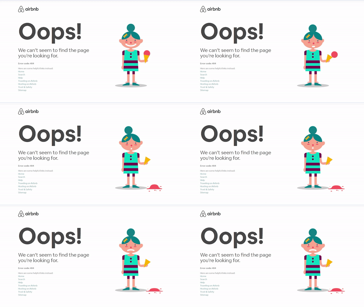
Airbnb gives you seven links to other parts of their site.
- Add a touch of humour or fun (if it suits your brand)
Humour is a great way to lighten the mood and make reaching an error page less frustrating. Just make sure it suits your brand. A travel blog might say, “Looks like we’ve taken a wrong turn. Let’s head back” while a bakery could quip, “Crumbs! We can’t find what you want.”
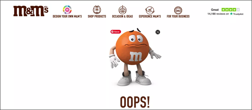
Or you could just say Oops! And let your navigation bar at the top help the user to try again.
Parting thoughts
Your 404 Error page is a golden opportunity to turn a frustrating moment into a pleasant one. By infusing your brand personality into this often-overlooked part of your website, you can create a positive user experience that leaves a lasting impression. So the next time someone takes a wrong turn on your site, make sure they’re met with a page that’s as engaging as your brand.
Frequently Asked Questions (FAQs)
A 404 error happens when someone tries to open a URL that doesn’t exist on your site. Common causes include moving or deleting a page without updating internal links, publishing a wrong link, or a visitor mistyping a URL. Regardless of the cause, it creates a “dead end” that can frustrate users and drive them away.
A good 404 page keeps users from abandoning your site when something goes wrong. Instead of a dead end, it gives people a clear way forward, like links to key pages, a search option, or a primary call to action. That reduces bounce rate and protects trust during a frustrating moment.
Include a short explanation, a clear path back (home page link), and practical navigation to common destinations. A search bar is also a strong addition because it lets users self-correct instantly. The goal is to remove friction: help people find what they meant to find, rather than forcing them to start over.
Write like a human and prioritize clarity. Start by acknowledging the page is missing, briefly explain why it might happen (moved, deleted, typo), then give the next step: search, browse key links, or return home. If your brand allows it, light humor can work, but helpful guidance matters more.
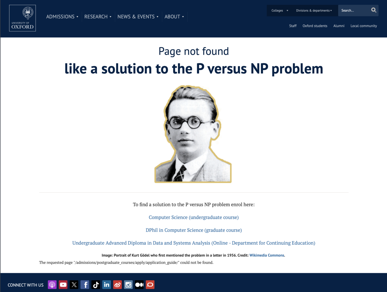
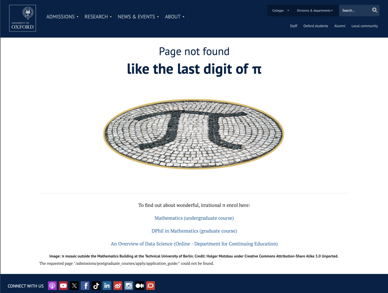
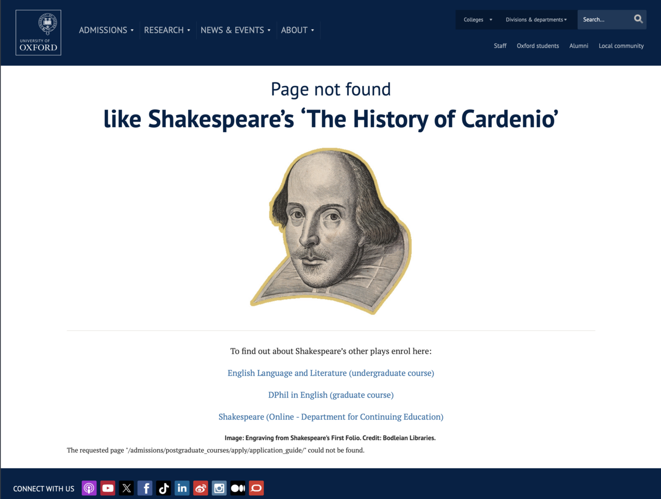
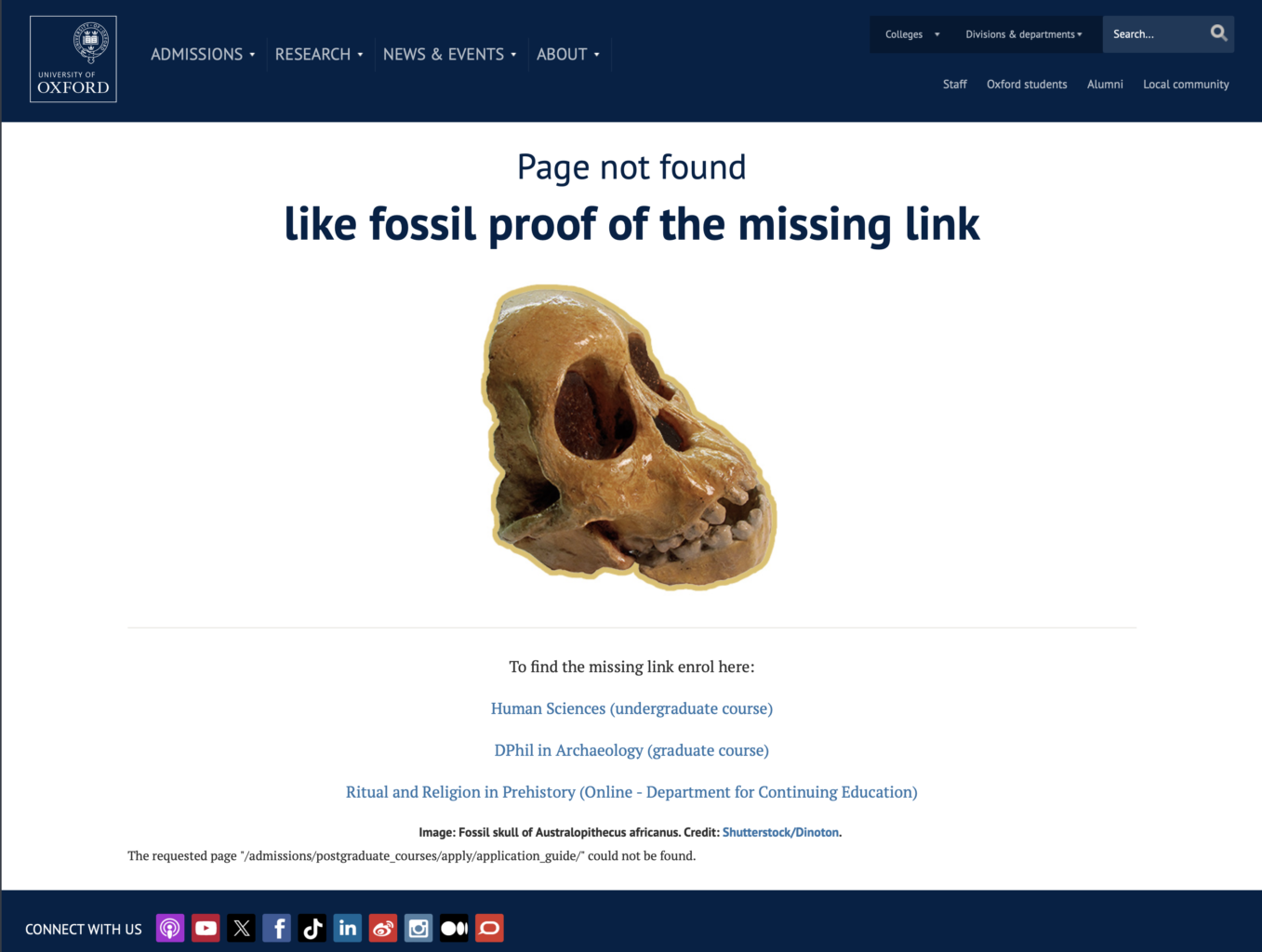
Here are two websites that don’t just have one 404 Error page, but a series of them.
These are from the imdb.com (Internet Movie Database) website, which uses quotes from movies for their 404 Error pages.
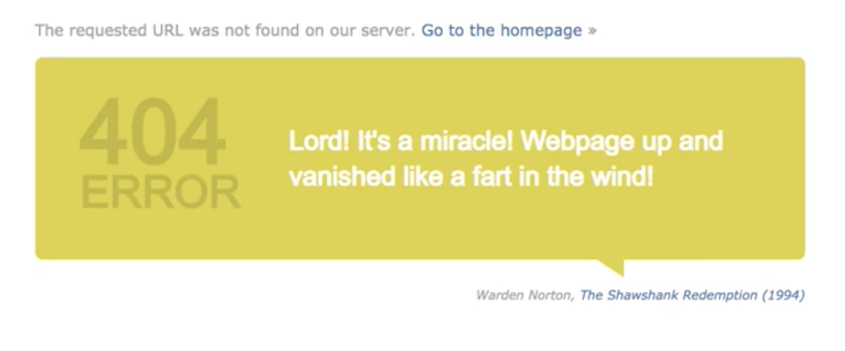
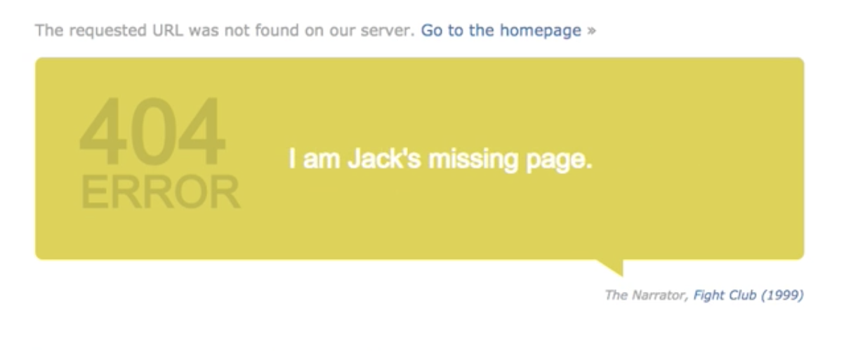

The last series is from the University of Oxford. It’s amusing and appropriately highbrow.
