Zeitguys was engaged to build out an entirely new, highly visual website for The Harbourfront Centre’s International Festival of Authors. Being a festival website, the content is timely and highly dynamic – WordPress development was a natural fit as the underlying CMS framework.
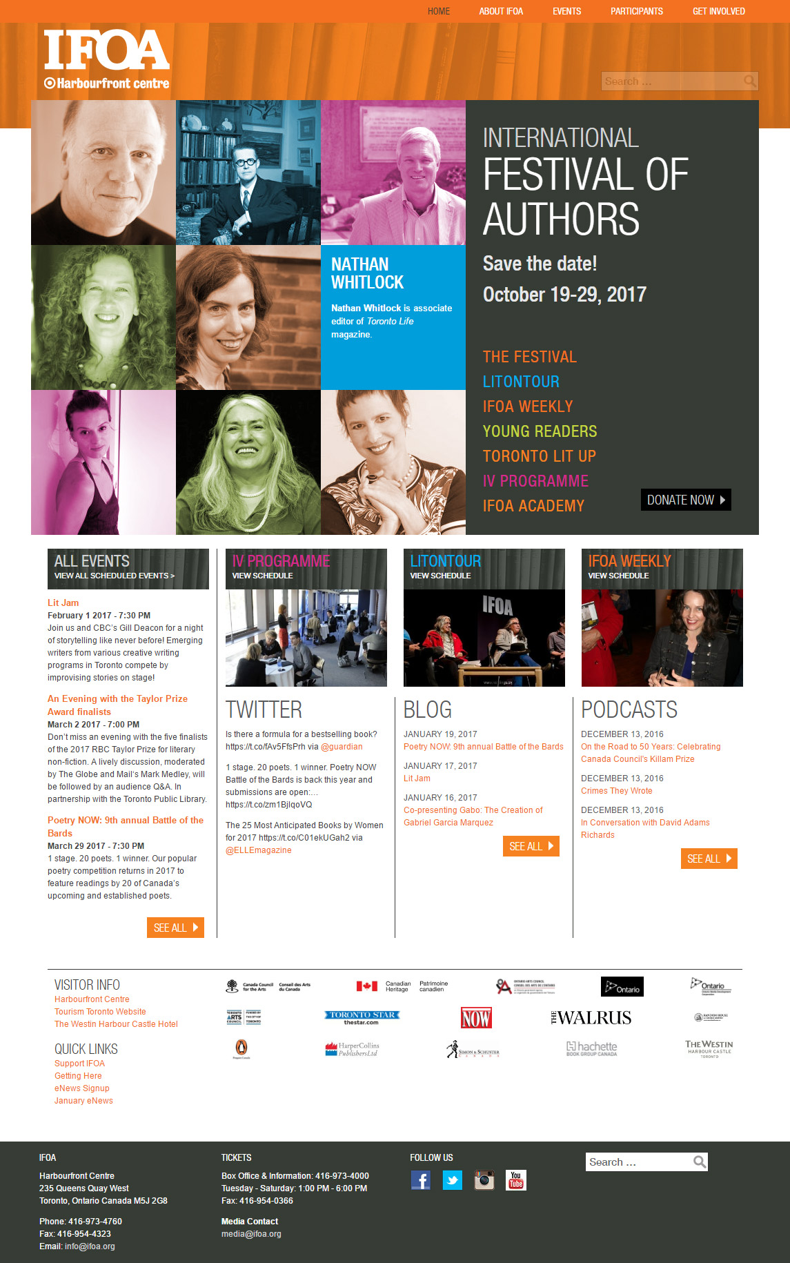
Art Director Janice Ivory Smith delivered a keen and compelling visual design that references previous years’ marketing materials while providing a striking look-and-feel that places the events and authors at the forefront.
The mobile experience is a vital consideration for all websites, but a Festival website must especially be responsive given the nature of its target audience. Great care was taken to ensure that the site responded to a wide variety of mobile form factors, adapting its layout accordingly. A number of “breakpoints” accommodate different devices and aspect ratios and the in-browser experience transitions quickly and smoothly between them.

Subtle high-tech
Beneath the hood hides a wealth of cutting-edge tech developed to support dynamic content while enforcing adherence to the hand-crafted design conventions. On the homepage, author headshots are colourized in real-time to match a predetermined visual pattern, while their “cards” are being asynchronously served up in random order. The “logo parade” at the bottom of the screen dynamically calculates the optimal sizing and positioning of sponsor logos based on a complex grid algorithm that can be fine-tuned by the administrators of the website using a graphical interface.
Event focused
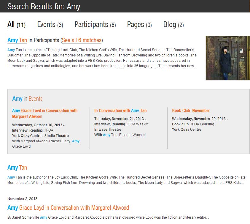
The primary use case for site visitors is locating festival events, so naturally a great amount of time was spent ensuring an intuitive user experience. Researching and locating events to attend becomes a slick affair, leveraging both a highly interactive Event Calendar view and a next-generation textual Search that prioritizes events and authors, and pushes WordPress to its very limits without sacrificing performance.
The team iterated many times over the UI and feature set of the Event browser, to create an intuitive user experience that accommodates the periodic nature of the Festival’s events. Users can see 5 months at-a-gulp, and can easily locate the high activity periods using the Calendar widget. Complete event listing details are presented on the page, synced to the Calendar widget display, so there’s no need to click through to read an event’s details.
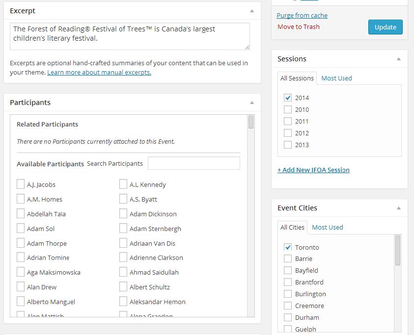
Events are tightly coupled to participants, and these relationships are surfaced bidirectionally on the site, allowing users to track who is speaking at an event, and what events an author is participating in (now and in the past).

The “Administrative User Experience”
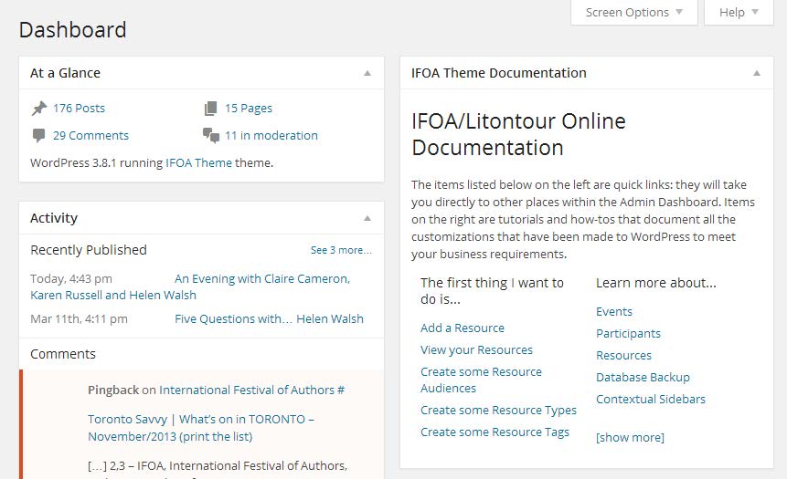
Much is made of “User Experience” (UX) these days and the buzzword is ubiquitous. We understand that one of your web site’s primary users are your own staff, whose responsibility is the curation and upkeep of the site’s content. This is why we put so much extra care into the development of back-end workflows and ergonomic tools, to make sure your site administrators can do everything they need to do without jumping through hoops.


