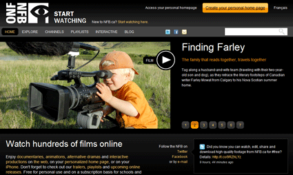
“Design Focus” is a regular Online Friendly feature that examines well-designed sites to show how Web designers have overcome some of the challenges of their profession.
This week’s featured site: The National Film Board
The National Film Board of Canada is one of the country’s most respected institutions – this significantly raises the expectations for its website. In this post, the website experts at Kobayashi Online explain some of the challenges this site has overcome to live up to the organization’s reputation.

Delivering to different audiences: simultaneously
The NFB has produced more than 13,000 productions across a variety of topics with the purpose of provoking discussion and debate among audiences in Canada and around the world. The NFB website reflects this purpose and scope, housing hundreds of films both well-known and obscure side-by-side.
Many sites would suffer from this abundance of choice, but the NFB manages to show its vast selection without overwhelming online visitors. At the top of the page, NFB has feature content in a revolving javascript box to highlight certain titles to suggest some sure bets. For those with a particular interest or with a certain type of film in mind, the site’s video collection is searchable, and browsable based on categories such as “biography” and “hot topics”. There are also hand-selected playlists, which let visitors rely on others’ expertise to help them decide on films they would most enjoy.
Rather than being tedious, the NFB site makes the experience of sorting though its hundreds of films exciting by promoting discovery of different films, but it also provides the tools to make informed choices about what content you want to access.
With images turned off in Internet Explorer 9, the National Film Board blog retains its formatting and readability.
A focus on accessibility
The NFB site is a great example of online accessibility. It’s a government site, and all government sites have to conform to a huge set of rules for accessibility. But accessibility is also important if you consider just how many people live with disabilities, and the value you add to your site by providing an easy way for them to use your site.
If you visit the NFB site and turn off all your styles, you see the page sort of like an accessible browser would. The very first link is…”Skip to Content” and the second is “Accessibility” which talks about how they do have CC and DV content available and how to recognize and use it.
It’s very sophisticated how this is basically hidden from everyone but accessible browser users. And that’s just one of the basic rules of getting people with disabilities around your site a bit easier using very simple CSS. You’ll also notice how well the page falls apart without the style. It’s lengthy this way, but also illustrates how a design can break down elegantly.
There’s another reason to build accessibility into your site: all search crawlers view the Web as blind and deaf users. This means that the very same standards meant to improve site accessibility directly improve SEO performance.
The National Film Board site displays well on an Android phone.
Compatibility with different screen sizes
The NFB site was able to tackle the challenge of a world with extremely diverse screen sizes and conquered it elegantly with design and code.
The site adjusts for different widths, while always keeping the integrity of its design, user interface, and user experience from small to large. We tested it out on the iPhone 4 and a full-screen browser, and it looked wonderful on both.
Not many sites can encompass the width of a full 24” monitor and still look good. Most solve the problem with containment and centering, where anything past the left and right edges on a large monitor is “background”.
We did notice a small detail that was lacking. For the “Become a member” form, they didn’t use “type=email” for the email address field. Using type=email for the form field causes the iPhone to present a different keyboard (geared towards entering email addresses – with the @ & period readily available). For such a perfect site, we were surprised the NFB didn’t use it, but given that it’s fairly new, we’ll forgive them.

