
Is your best sales rep asleep on the job?
Your website works 24/7, promoting your business and brand. Each visit to it creates an impression of you
in the user’s mind. And if you haven’t updated your site since 2019, it’s probably looking tired and
performing less effectively, especially since so much has changed in the world since 2019.
But you may not need to replace your site yet—or even give it a total makeover.
Maybe your sales pitch needs some rejigging. Maybe some key pages need a fresh look. Or maybe your
site needs an injection of new energy to restore it to peak performance. Here are seven ways to wake up
your star sales rep. They’re tweaks—not radical surgery.
Would you rather watch a short
video than read our blog post?
If so, pour yourself a coffee and click the
button to view our 7 Quick Fixes episode
of the KZ Show. It’s less than 8 minutes
long, but it covers a lot of ground!
For more details and examples than we could fit in our brief video, read on!
Either start at the beginning and read all 7 Quick Fixes, or click on a Quick Fix in the table of contents
below and go directly to what interests you most:
- Consider adding NEW (and deleting OLD) content to freshen up your site.
- Try to SIMPLIFY your navigation to match how users want to use your site.
- Tweak your site’s LOOK to make it feel more modern. A minor facelift can go a long way.
- Focus on updating your HOME page (and other key pages) to make the most impact, fast.
- Get rid of your SLIDERS (and do this instead) because people hate to wait.
- Scatter TESTIMONIALS throughout your site, where people will actually read them.
- Strengthen your site’s SECURITY – and get everything up to date.
For a summary of our 7 Quick Fixes to Refresh Your Site and Add Years to its Life, click on the download button below.

Has your best sales rep been napping?
Quick Fix #1: Add new (and delete old) content to freshen up your site.
If your website is a few years old, it probably isn’t as up to date as it should be. What’s changed—and
what hasn’t, but should?
- Have you added a new product or service since you last updated your website?
- If so, is it featured on your home page, or hidden away where a user could miss it?
- Have your business hours changed? How about your contact info?
- If your site includes bios, are they still up to date?
- Does your site meet current rules governing accessibility and privacy? If so, flag it. If not, fix it.
- Has your industry adopted new health, safety or sustainability standards that users need to be
reassured about? - Are climate change and extreme weather events affecting your industry and users? If so, are you
doing anything to respond to that? - Have customers become more cost-conscious than they were before? If so, do you have a new
offer or deal to entice trial—or can you come up with one? - Has your competitive landscape changed? (Have you even checked lately?) Chances are, you have
new competitors and some old ones have upped their game.
Conduct a DIY competitive audit:
- Google your type of product or service and see who comes up ahead of you in your search.
- Check out their sites and how they market themselves. (Save screenshots for reference.)
Be brutally honest and ask yourself:
- How does your home page and its messaging stack up against theirs?
- Now ask other people you know to look at the same home pages and ask which one they’d
choose if they were a customer. Their perspectives may surprise you by differing from yours. - Do your competitors regularly update their sites with news and/or blog posts? Do you?
- New content helps you keep pace with – or pull ahead of – your competition. Because if you stand
still, while everyone around you moves forward, you’re falling behind.
Remove or revise old content:
- If you can’t add a new blog post at least once a month, remove your blog. When your blog posts are recent, they make you look dynamic; when they’re old, they make you look stagnant.
- Go through your site page by page and remove outdated content (or bring it up to date).
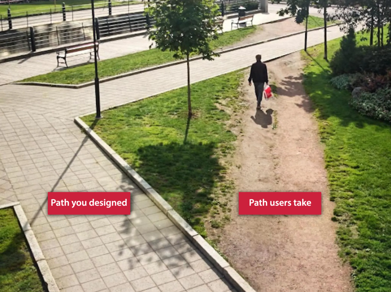
Can users use your site the way they want to?
Quick Fix #2: Simplify your navigation
The way you organized your website’s content may make perfect sense to you, but it may not be how your users want to navigate your site. Your site needs to be organized to meet their expectations, and usually, that involves simplifying it.
That’s why we like to do card-sorting research; it reveals how users categorize your content, where they
expect things to be, and how easy or hard they find it to perform tasks on your site.
We’ll be covering card sorting in detail in a future blog post. If you’d like to be notified when we publish it, click here so we can email you. In the meantime, here’s a link to a good Card Sorting 101 article we found: https://www.optimalworkshop.com/learn/card-sorting-101-introduction-to-card-sorting/
Bear in mind that there are two types of users:
Explorers: They like to look around before they do
what they came to do. But if it isn’t easy for them
find their way back to the page they need, they
may simply give up and leave.
Speedsters: They’re impatient, wanting to find
things in a hurry and complete tasks with the
fewest clicks possible. So if it isn’t quick and easy
to find what they came for, you’ve lost them.
Sobering fact: most users fall into this category.

Do a DIY site audit:
- List all the tasks that people do on your site (e.g., submit a form, find a person, product or service)
- Then be a user and try to perform them.
- Afterwards, ask a few people who aren’t familiar with your site to perform the same tasks—and
watch what they do. - Could they find what they were looking for without any trouble?
- Were the tasks quick and easy for them to accomplish?
- Were these tasks just as quick and easy to accomplish on a cellphone as on a laptop?
- How many clicks did these tasks take (4, 8, 12)?
Your site may need some reorganizing to be more user-friendly.
And while you’re at it, get rid of your least-used links. If they aren’t being used often, they’re just
contributing to site “clutter.”
Tip: Make your main navigation bar simple, complete and easy to access from any page on your site.
There are several formats for navigation menus, each with its own strength:
- Primary horizontal navigation bars in the website’s header (the most common kind)
- Primary vertical sidebar navigation menus (ideal when section names tend to be longer)
- Primary or secondary dropdown navigation menus (ideal for content-heavy sites)
- Primary or secondary footer navigation bars (ideal for complex or content-heavy sites)
- Hamburger navigation bars (generally restricted to cellphone screens)
Rules of thumb for navigation bar capacities:
- In general, primary horizontal navigation bars should be limited to seven or fewer items.
- Vertical ones generally have room for more than seven.
- Dropdown and footer menus can accommodate as many as 50 items.
Examples follow.
Sites like the Nashville Zoo use a standard horizontal top navigation bar with individual dropdown menus that don’t obscure much of the main image or overwhelm the site visitor with too much info at once.

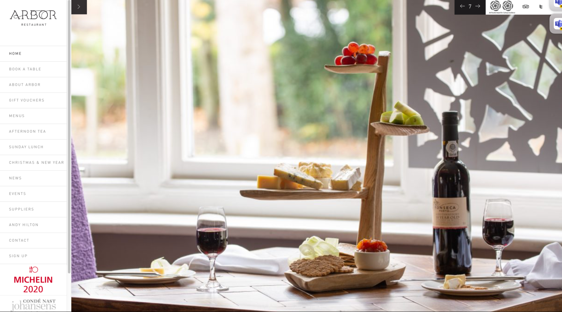
Sites like this UK restaurant use vertical sidebar navigation menus because they allow them to list more
than seven sections and they can easily accommodate a dozen or more section names as short as NEWS
and as long as CHRISTMAS & NEW YEAR.
Complex, content-heavy news sites like Politico use dropdown navigation bars in their headers, accessible
by clicking or hovering over an icon at the top left.


Some sites like Sephora use a top navigation bar with full-width dropdown menus that can include ads.


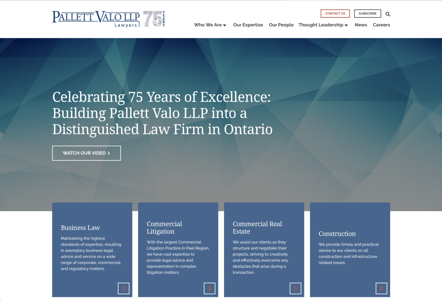
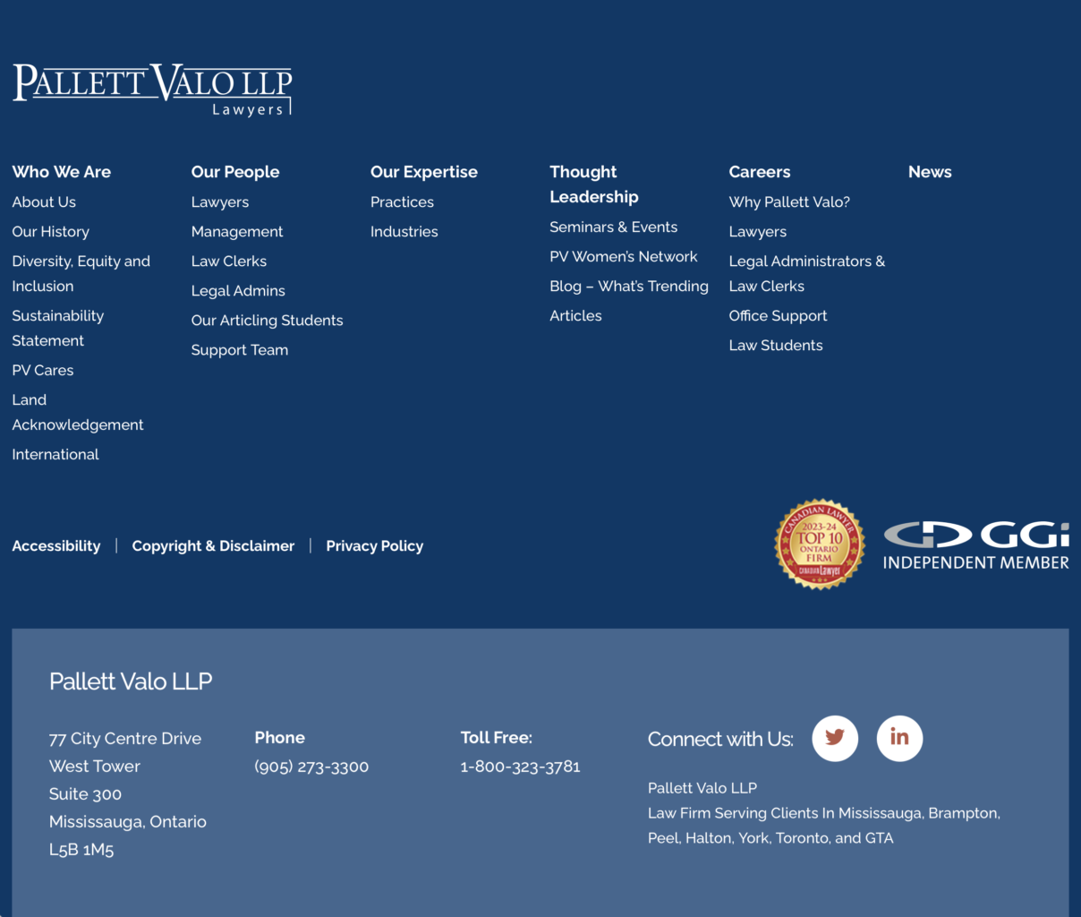
For Pallett Valo, we created a primary horizontal navigation bar and a secondary footer navigation bar
that would be visible on every page of their site:
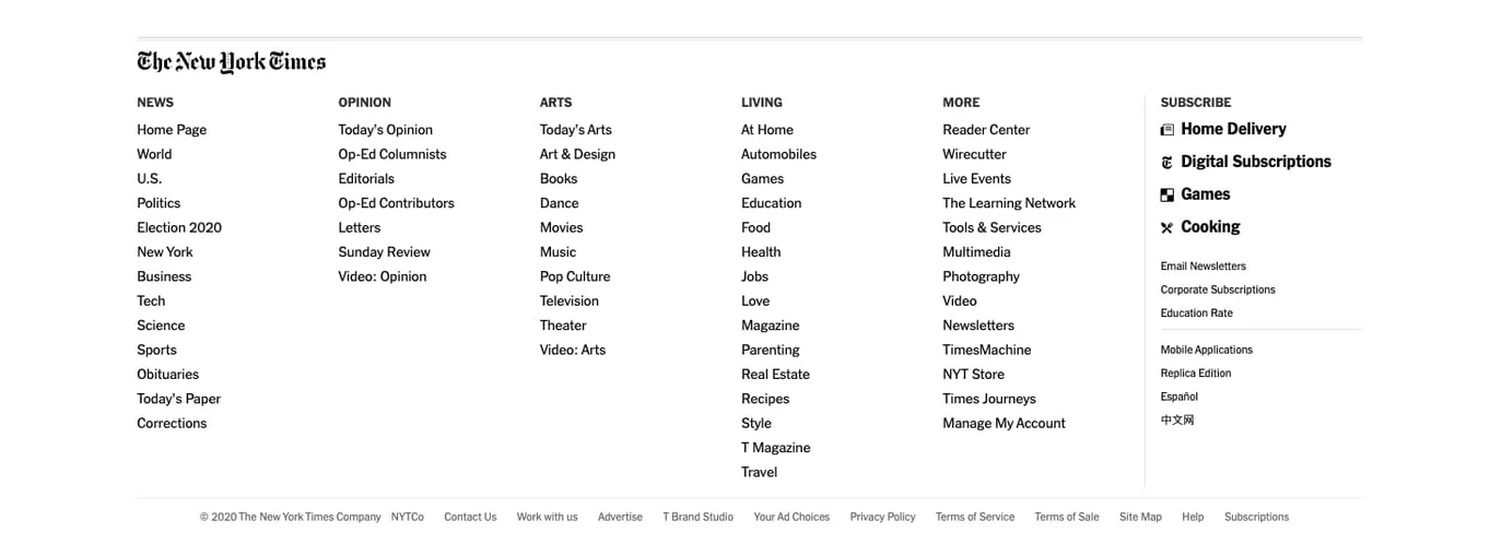
The ultra-complex New York Times site uses three navigation bars: a primary horizontal navigation bar
across the top, a secondary vertical navigation bar at the left that appears when you hover over an icon…
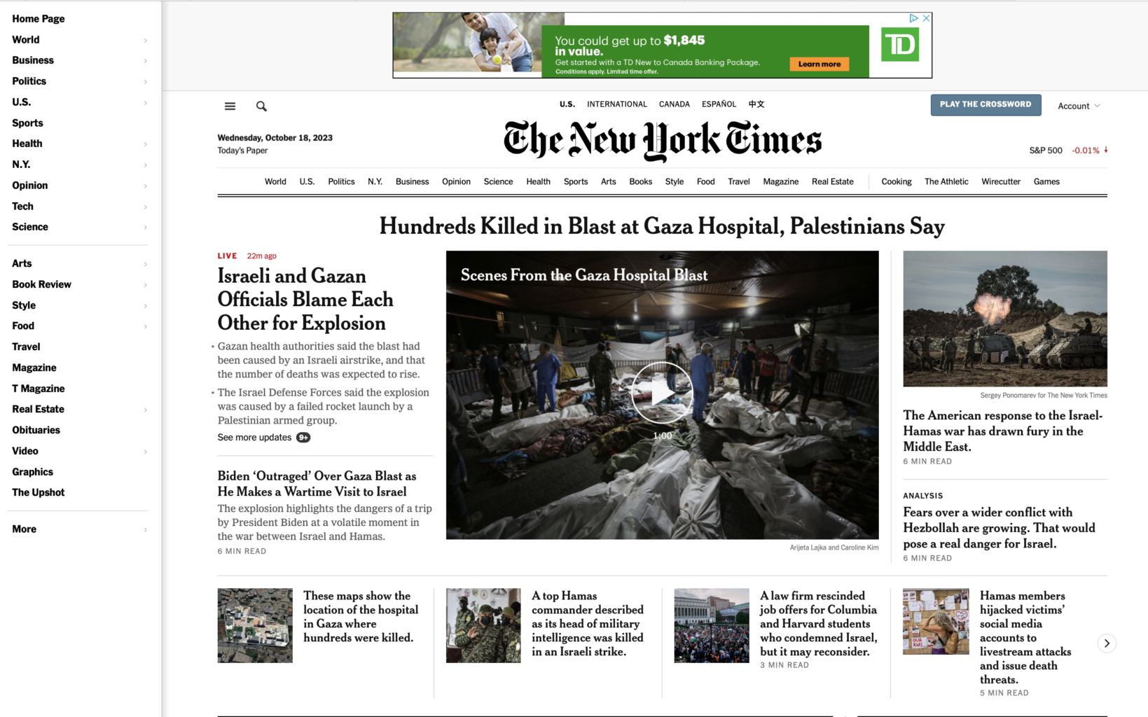
and an extensive footer navigation bar at the bottom. Chances are, you’ll never need that many!
So, how easy is it for your users to find exactly what they’re looking for, regardless of where they are on your website? How much help are your top, side or footer navigation bars giving them? Do they have to wade through multiple sub-menus to get anywhere, or is everything accessible to them, whatever page they’re on? What can you do to simplify your navigation?

Has your designer been snoozing on the job?
Quick Fix #3 Tweak your site’s look
If your site isn’t very old, it probably doesn’t look dated, but it may need some freshening up.
Give your site a long, critical look – as if you were seeing it for the first time:
- Are your colours dull and drab?
- Is your header big and full-width or
is there an old-fashioned white margin
around it at the top and the sides?


- Do you have a lot of type and too few graphics to break it up? Type-heavy pages are very off-putting; they look like hard work to read.
- Do your key points jump out at you or are they buried in the copy?
- Do you have clear calls to action, prompting users to act now?
- Have you been adding things to your site that don’t look professionally designed?
Freshen up your site’s look:
- Rethink your colours – go lighter, brighter, or more dramatic.
- Make your header full-width if it isn’t already – headers bordered by white look passé.
- Add more graphics – icons, photos, illustrations and diagrams.
- Make your key points stand out – highlight them with bigger, bolder type.
- Make your calls to action unmissable with a pop of colour.
- Get a professional to redesign any additions you made yourself so your whole site looks polished.
(Make a list of the pages you added content to, so nothing gets missed.)


Need some touch-ups to make a great first impression?
Quick Fix #4 Update your home page
Your home page is where people form their first
impressions of you, before they do any factual
research. It needs to impress users — and tell
them what they most need to know:
- who you are + what you can do for them
- what’s new + how to navigate your site
Your home page is also the jumping-off point for all your other content, so improving it – and any other
key pages – could make the biggest difference in making your site look and perform better. So…
Do a DIY home page audit:
Pretend you’ve never seen your site before and
you don’t know anything about your company.
You’ve just clicked on a link when searching for a
company in your field.
Now look at your home page. REALLY look at it.
- What’s your first impression: WOW or ho-hum?
Professional or not so much? - Is it impressive or intriguing, or is it okay but
nothing special? Does it make you want
to read more? - Do you know IMMEDIATELY what the company
does, who it serves and what it can do for you? - What brand personality does it project
- Dynamic?
- Fun?
- Serious?
- Stuffy?
- Friendly?
- Conservative?
- Innovative?
- Boring?
- Does it provide answers to the first 2-3 questions a site visitor might be wondering:
For DTC/retail:
– What do you specialize in?
– How expensive are you?
– Where are you, or do you deliver?
For B2B/corporate:
– What do you specialize in?
– What makes you different?
– Are you great at what you do? - If your home page doesn’t answer these questions, does your primary navigation bar show you where to find these answers?
What do you need to improve? What can you tweak?


Fact of life: people are impatient.
Quick Fix #5 Get rid of your sliders.
On the Internet, 30 seconds can feel like an hour. Today’s users have no patience for sliders. They won’t
wait for them to change. They want to see what’s on the site as quickly as possible. And they want to get
to what they’re looking for as fast as they can. So they’re never going to see more than one or two images, especially if they can’t click through them at their own pace (fast).
Choose one to be your focal point, then get rid of the rest. Or shrink those slider images and show them
further down. (You could also opt to use a video instead of a static shot)
What’s the ONE thing you want people to know when they arrive at your site:
- Your positioning in the market?
- Your new product or service?
- A special deal or a special event?
That’s your focal point. Convert the other sliders into navigation links to take users to those pages.
For example, if you lead with a new product, product line or a new service, make sure that your perennial bestseller(s) are still represented, but without them competing with your big news.
This way, users can see everything all at once, and they won’t miss anything you want them to see.

Testimonials are valuable—but only if people read them.
Quick Fix #6 Place testimonials where people will stumble over them.
Whatever you do, don’t put them all on one page.
When you do that, you’re creating work for the user. You’re forcing them to scroll through irrelevant ones to find a testimonial relating to the one product, service or individual they’re interested in.
Besides, what if the user never visits that page?
So where should you put them?
Place testimonials and reviews where people will find them by accident – and read them. But don’t just place them anywhere. Put them on the pages where they relate to the content: the product they’re raving about, the quality of your service, or the brilliance or helpfulness of someone on your staff.
That way, people will absorb how amazing you are while they read about whatever it is that they’re interested in.
Ideally, place them on pages where your potential customer feels some friction or anxiety – because that’s where a personal reassurance from a client can have the most effect.
According to a study by Trust Radius*, 91% of respondents regularly read testimonials before making a purchase. Testimonials and reviews provide them with unbiased third-party confirmation of the value of a product or service, making them fee confident that they’re doing the right thing.
Other good places to put them: near your CTAs (calls to action), on your product pages, on sign-up forms, or adjacent to your “Add to cart” button…anywhere the user may need a final nudge.

Above and at the right: testimonial quotes are placed at the base of product pages and relate directly to those products.
Below: Whenever possible, abridge wordy quotes to ensure that the most important part gets read. The one below should have zeroed in on the emotional last sentence:
“You have changed my life by supporting my mental health and you have helped me to become a better momma to my boys.”

https://www.trustradius.com/vendor-blog/case-studies-vs-user-reviews-frenemies-113

Are your cybersecurity safeguards asleep at the switch?
Quick Fix #7 Strengthen your site’s security.
Unless your website is brand new, it may be vulnerable to hackers—even if you miss only one security update. And if you’ve been using a lot of plugins, you may have missed quite a few. Job One is to make sure that every system and component is secure:
Check for updates on everything:
- Update your website software (e.g., WordPress, Drupal, or Joomla) and every plugin you use.
If you don’t have an IT professional maintaining your site for you, make sure you update your software regularly – or opt for automatic updates – then check your site’s operation after each update to make sure the latest one hasn’t broken anything!
If you use a website provider like Squarespace, Wix or Spotify, they’re almost certain to be handling all software updates for you.
- Update your website’s operating system (yes, it does have one – just like your phone!) and its supporting technology, like the PHP version.
Ask your IT department or web host what version you’re running and confirm that it’s the latest. Then ask if it’s up to date, security-wise. (You might be surprised by the answer.)
- Use a top-rated password manager (e.g., NordPass, RoboForm, Keeper, 1Password etc.)
- Use auto-generated “strong passwords” that are virtually impossible for hackers and bots to guess because they’re randomly generated alphanumeric gibberish and contain no recognizable words.

- Train your staff in online security, including:
– The importance of using strong passwords and a password manager (vs writing passwords on sticky notes or in a notebook)
– Why they should never share passwords, PINs, or answers to security questions
– Safe Internet and social media usage
– How to spot phishing and pharming attempts (via emails and texts)
– How to recognize malicious emails and texts (e.g., phishing or pharming attempts)
– What to do – and NOT do – in the event of a ransomware attack
The Government of Canada provides good basic information at
https://www.cyber.gc.ca/en/guidance/provide-employee-awareness-training
But try to find a local firm offering online training sessions, too.
There’s no substitute for having an expert you can talk to and who can answer your questions right away…
instead of trying to Google an answer to a very specific question, or having to wait on hold for what seems like hours, listening to a recording telling you that your call is important. (We’ve all been there.)

In a future blog post, we’ll be covering cybersecurity in far more detail, focusing on what marketers need to know. If you’d like to be notified when we publish it, click here so we can email you.
Frequently Asked Questions (FAQs)
Start with high-impact updates before rebuilding anything: clean up outdated content, simplify navigation, modernize key design elements, and improve conversion pages like your homepage and service pages. Small changes like removing sliders, adding testimonials, and tightening messaging can make an older site feel current again. Pair it with basic security and performance fixes.
Update anything that affects trust and decision-making first: your services, pricing approach (if applicable), contact details, staff bios, homepage messaging, and proof points like testimonials or case examples. Then audit older pages for broken links and stale information. Visitors notice outdated pages quickly, and it can make your business feel inactive.
If you cannot publish consistently, an old blog can hurt perception because it signals inactivity. You do not always need to delete everything, but you should audit: update evergreen posts, consolidate overlapping topics, and remove content that no longer reflects your services or standards. If you cannot maintain it, focus on stronger evergreen pages instead.
Design navigation around user tasks, not internal organization. List the top things visitors come to your site to do (learn services, get pricing context, contact you, trust you), then make those paths obvious with fewer options and clearer labels. If people need to think about where something lives, the navigation is too complex.