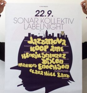
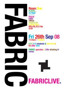
Sometimes bad design can be good. Ahem, sorry, let’s try this again: Bad design can meet the client’s objectives. But even though bad design sometimes hits the mark, we think there’s no excuse for bad design. And furthermore, you can incorporate whatever trickery that make horrible designs work into something that’s truly elegant and beautiful.
We were thinking about this lately after reading a lively Reddit thread in which a designer complained that his nightclub poster was rejected because it didn’t look like a typical – presumably garish – nightclub poster.
The discussion around this example turned towards a problem in the design world: the type of design that gets good marks at university or wins awards may not meet the needs of real-world clients. In fact, some of the worst materials (at least from a design perspective) hit the mark for clients. But this is because they actually adhere to some design principles used by the best designers.
Many of the elements of nightclub posters make designers cringe, but designers cannot deny that the poster succeeds in communicating the desired message to the intended audience. Good designers can take these elements and make them their own by using them in unique and creative ways.
Here are three examples:
1. Including Visual Cues for a Specific Audience

What the club owner wants is something that will communicate to the intended audience. It must be in a style that people who go to clubs understand. This could mean the inclusion of imagery that designers may find tacky like the smiley faces and crossbones, the overuse of neon colours, or the reliance on gimmicky fonts and effects. These are all signals to clubgoers what kind of event it is when they see the poster on the street. It will be instantly recognizable to them from a mile away.
Now there’s a difference between making something that’s instantly recognizable as just another club poster and something that really compels someone to take a second look. This is what good designers can do.
2. Drawing Attention to Pertinent Information

An event poster must present a case to the viewer to come out to the event. A great way to do this is to present the pertinent important, which is often includes the DJ or band playing and the date. Putting this in the forefront will enable people to determine if they’re interested in the event and if they’re free that day. This can only take a few seconds, which is the right time span for someone who sees a club poster.
If the artist and date appeal to them, they’ll be more likely to take a closer look, and find out how much it costs, where it its, and other details that could clinch the deal. Don’t hide any pertinent information that will help people decide to go or not.
Good and compelling design can also be used to help draw people in. If they see something interesting, they’ll be compelled to take a closer look and find out details like the price, date, artist or location. The design and style should communicate more information, and provide the whole story to someone who’s considering going to the event.
3. Copying Competitors is Safe (but Limiting)

Whether it’s intentional or not, many clients may want design that is safe and in-line with what competitors do. What many don’t know is that something unique can actually help appeal to new, different, and (oftentimes) bigger audiences.
Instead of using all the same design elements as the other nightclubs on the block, designers could risk doing something different. And while there’s a risk of alienating the typical nightclub clientele, it could appeal to a wider audience to which a typical nightclub doesn’t cater.
Bad design could meet a client’s expectations, but it’s not really good enough to design to a poster that’s simply the same as the nightclub down the street. There’s always room for clever design – even in the most regimented fields.
Summary: Knowing How Bad Design Works Can Make For Great Design
What’s crucial in designing for a particular industry and audience is respecting the visual language to which they’re accustomed. Making great design around these products could mean respecting some rules (the use of neon hues) and breaking others (messy and crowded layout). Knowing these rules and when to break them comes with understanding the industry and audience.
The client can help you understanding their brand, who their customers are and what appeals to them.
While designers may think they know better than their non-designer clients, they often don’t.
And this is sometimes hard for designers to admit.
And on the other side, clients have to understand that they have to work with a designer to help them understand their brand, audience, and approach.
This may take some back and forth, some revisions, and an understanding that first drafts won’t be perfect.
Creating a design that is consistent with what an audience typically expects certainly has a value and appeal. But the designer and client have the opportunity to work together to strike a balance between keeping elements that appeal to a certain segment of people, and developing a design that incorporates uniqueness and originality.
If done well, this sort of design can be very strong, and has the potential for a company to differentiate itself in a marketplace of clones and copycats. And it’s all due to great design.
As a creative design agency, Kobayashi Online tries to create websites and logos that are relevant to intended audiences but also innovative and unique. Let us know if you need help making your brand stand out!