“Design Focus” is a regular Online Friendly feature that examines well-designed sites to show how Web designers have overcome some of the challenges of their profession.

Blind Barber
Blind Barber is a high-end barber shop with a location in New York and one opening in LA. We think their site does a good job of communicating a business’ culture and values through very tasteful design and atmosphere, as well as a sense of fun.
In this Design Focus post, we put their unique website under our Web design lens.
Picture Window
There’s a reason that barber shops have big picture windows — they show people from the street what’s going on inside.
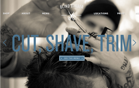
Similarly, Blind Barber site shows visitors exactly what the business is about using huge images that take up the user’s screen (in the high-impact area “above-the-fold”). This can be a really bold look for a webpage because they saturate the visitor with your vision.
Of course, with an image taking up all the above-the-fold space, you have to rely on visitors scolling down to find out more about your company. This is a gambit that doesn’t always work. The header image, after all, makes visitors work to get the information they want — whether it’s business hours, locations, other anything else.
These large images at the top of each page can also be cumbersome for mobile users, who have to zoom and scroll in order to make sense of the site.

Capturing the 20’s with a designer’s eye, and a camera’s lens
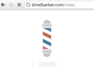
With the goal of channeling the “roaring twenties”, they have great branding throughout, including a barber poll loading screen, a consistent colour and font scheme, a logo that is featured prominently on every page.
And, of course, everything is enhanced by the great photography. Again, much like in our review of betterplace.com, the photos are manipulated to fit with the site’s colour scheme. In this case, the images are given a blue hue.
Great use of fonts
Fonts can be used to elicit a mood, and Blind Barber does this well. The site’s top navigation features the museo-sans font with a slight grey drop shadow. Museo-sans adds extra oomph since it isn’t a standard Web font. They use Typekit, but we cover some of the other options in our post on Web typography services.
Meta data is missing
One thing that we would have liked to see is the inclusion of description and keywords meta tags. And while the keywords attribute is of little interest to Google, the description attribute is supported by most major search engines and shouldn’t be left empty. However, titles are tagged using header tags (such as h2, h4, and h5), giving search engines plenty to crawl.
A grid is a powerful thing
Grids are a common design element from newspaper pages to brochures. This concept, of course, applies to websites. Blind Barber uses a variable grid system based on SprySoft’s variable grid system, which creates a custom CSS file for a underlying CSS site grid. Instead of the standard 960-pixel-wide grid system, Blind Barber opts for a 1,040 pixel grid structure.
It’s all about what customers want
The design behind Blind Barber helps convey its business culture — its style, its services, and its uniqueness. There may be dozens of barber shops in your town, so it’s important for their owners to distinguish their barber shop from all the others.
This also goes for any small business, especially as more people go to the Internet to find out where to go. It’s important to create a site that provides the information visitors need, but having large headers on each page makes it harder for people to get to that information. Depending on the clientele, however, this may give the right impression.
Either way, when people are looking for local businesses, they’ll look to websites for information, and to provide a window into your business. This is important because it will help them choose your business.

