As you likely know, we develop most of our websites using the WordPress platform. When Toronto’s WordPress user and developer group announced an open competition to create a logo for WordCamp Toronto, the city’s WordPress “unconference”, we jumped at the chance!
As active participants in the Canadian WordPress community, we intended to create a logo that Toronto WordCamp organizers and attendees could be proud of. While our logo designs were not chosen, we’re still very pleased with the creative work we did and it allowed us to think about the design obstacles involved in designing the Toronto WordCamp logo.
This post will outline the creative process from inception, the intermediate development of logo ideas, and the final refining of individual logos.
1. Exploring design options with sketches
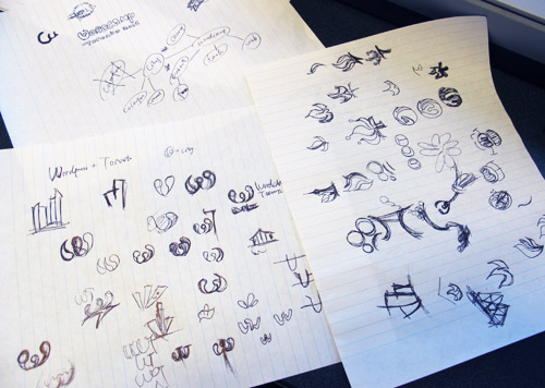
Our design process started with the free exploration of different ideas. Eva sketched dozens of possible logo concepts incorporating various symbols that could represent Toronto and the vibrant WordPress group.
The initial sketches help quickly show what ideas and design elements could be used in a logo. As the logo process continued, we would look back at the sketches to see if we could apply any of the original ideas and approaches.
2. Converting sketches into digital mockups
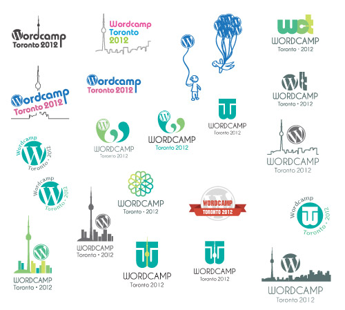
From the initial, rough-hewn sketches, we chose what seemed like the strongest logo ideas and developed them digitally using Photoshop. Once the designs were changed into vectors, they could be more easily manipulated. We could see how different colours and fonts would look and choose the best ones.
3. Further developing concepts using colours and fonts

Now that the concepts of the logo designs are more refined, we tried different colour schemes and typography to help make the logos more visually interesting.
4. Seeking feedback and refining further
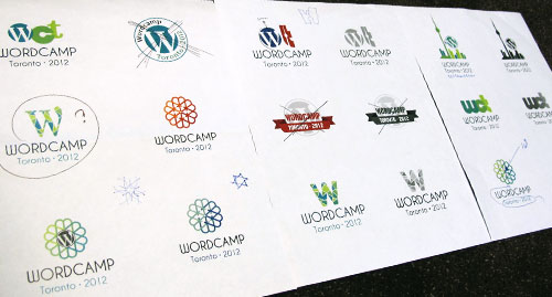
Now that the concepts behind the WordCamp logos have been developed, we printed them and sought feedback from everyone at the office to see which logos were most compelling and best represented the Toronto WordPress community.
As we refine logos, there sometimes comes a decisive moment where concepts that looked strong at the beginning start to fall apart. Further development shows cracks in an otherwise promising design. As we develop and refine logos it becomes clear which ones are most strong. Luckily several designs survived the development process.
5. Trying out different group names

Because the logo doesn’t exist on its own, we presented the logo alongside descriptive copy that colours the logo’s meaning. For instance, we added text such as “The Toronto WordPress Group” and “The Toronto WordPress Developer Group” to indicate what it’s about.
6. Presenting the logos
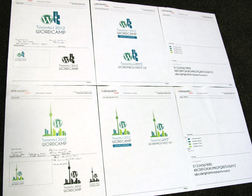
When we present logos to clients, we usually provide a handful of fully developed logo ideas that include a rationale. The rationale is a few short paragraphs explaining the key features of each logo, what messages they convey, and how it can be used to promote an organization. It will give the client the information they need to make an informed decision on which logo to choose.
We did the same presentation for WordCamp as we would for one of our paid clients.
For instance, this is the description for one of our logos:
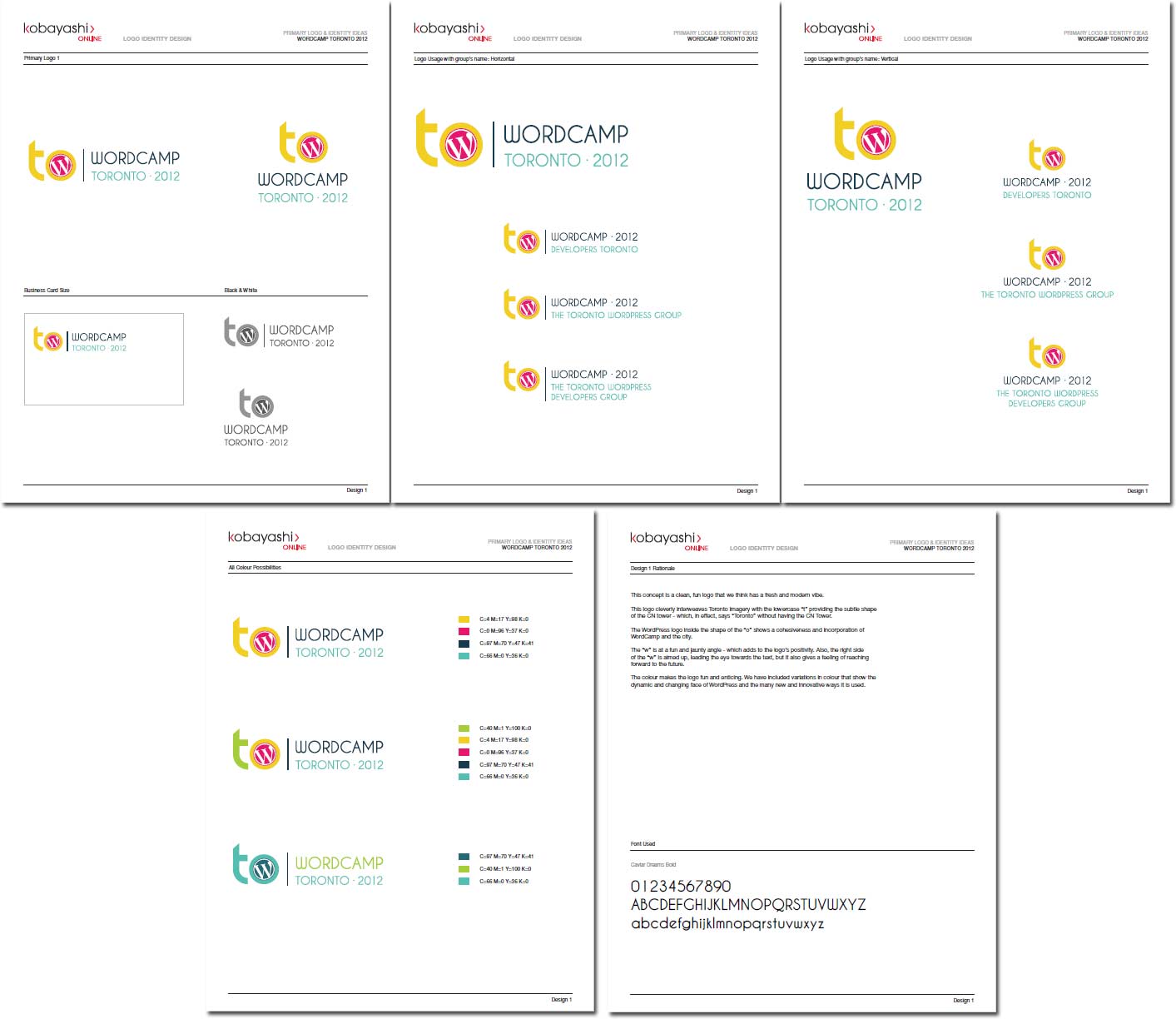
This concept is a clean, fun logo that we think has a fresh and modern vibe.
This logo cleverly interweaves Toronto imagery with the lowercase “t” providing the subtle shape of the CN tower – which, in effect, says “Toronto” without having the CN Tower.
The WordPress logo inside the shape of the “o” shows a cohesiveness and incorporation of WordCamp and the city.
The logo is very fun and positive with the “w” at a jaunty angle. Also, the right side of the “w” is aimed up, leading the eye towards the text, and giving a feeling of reaching forward to the future.
The colour makes the logo fun and enticing. We have included variations in colour that show the dynamic and changing face of WordPress and the many new and innovative ways it is used.
(See all our WordCamp logo submissions.)
7. And the winner is…
Like we said at the beginning, we’re huge supporters of WordPress and the WordCamp events. While we would have liked for one of our logos to have been chosen, congratulations to Valerie Crozier for winning the competition! We’re proud to have been part of the competition AND, we understand that attendees of WordCamp Toronto will get to see all the contest submissions – such a WordPressy community thing to do!
As members of the WordPress community, we’d like to thank Valerie and the other entrants for their effort, as well as all the others helping to make WordCamp Toronto one of the best WordCamp events yet.
how just some of the effort that’s going into putting on WordCamp Toronto – whether it’s putting together presentations and workshops, dealing with location logistics, or any other aspect of the event.
In this post, we shared a bit of our logo design process but we have more to share. We encourage you to come out and meet us at WordPress Toronto 2012. It will be a great opportunity to learn about WordPress from some of the country’s top experts and socialize with users and developers September 29 and 30, 2012 at George Brown College in downtown Toronto.
We’d love to meet you there!
Download the creative briefs we created for the five WordCamp logos we presented:
- WordCamp Toronto Logo Design Concept #1
- WordCamp Toronto Logo Design Concept #2
- WordCamp Toronto Logo Design Concept #3
- WordCamp Toronto Logo Design Concept #4
- WordCamp Toronto Logo Design Concept #5
Extra: The logos in context
In our submission to the WordCamp organizers, we didn’t include images of the logos in context, for instance, on t-shirts, handouts, websites and anything else. By showing the logo being used, the client can sometimes better understand the benefits of a particular logo. And it’s also a great way to get a client excited about what might be a big change or step forward.