A “call to action”, as the name suggests, tells your visitors what they should do. In the case of a website, it’s basically a message that links to a desired action.
A successful CTA will help persuade visitors to take your desired action, which you should be able to determine based on your business goals.
It can be a short phrase as simple as “Click here!”, but should be something at least a little more specific or sophisticated.
In this Online Friendly article, we break down some of the core concepts of designing an effective CTA.
Think of your audience
You should think about the tone, and action words that will get your target audience to click. There are, of course, different approaches to persuasion for different businesses. An anti-malware software provider may try to convince visitors that they aren’t protected from an infection. An e-commerce website may compel visitors using an offer of free shipping or another discount. Many companies offer a free email newsletter with the promise of exclusive discounts and/or specialized information.
Be specific
Take the guesswork out of clicking, be upfront about what you are offering. A Web design blog could have the following call to action: “Get our web design email newsletter.” This is to the point, but you could make it more specific: “Click to have web design tips sent straight
to your inbox every Wednesday.” It should be obvious what will happen by taking the action.
NOTE: While it’s often good to be specific, some calls to action are staples. “Add to cart” and “Add to bag”, for instance, are so well known by e-commerce consumers that anything else would likely be confusing. These calls to action are essentially clear, given that many people already understand what clicking them means.
Get your visitors to act…now!
Time-sensitive offers are a favourite gimmick used in infomercials to hock “As seen on TV” products, but there is no denying they are effective in getting visitors to act now rather than endlessly put the decision off. By incorporating a time limit into your call to action, you can cause people to more fully consider your offer because they now have something to lose by not responding quickly.
This time-sensitive offer can be a short-term discount or promotional offer, but it doesn’t have to be. An informative email newsletter could be considered time sensitive in the sense that someone will want to sign up if there is an advantage to having the materials delivered directly as soon as they’re available (e.g. the latest stock price speculation). Deciding to sign up now will assure them access to this information, otherwise they lose out.
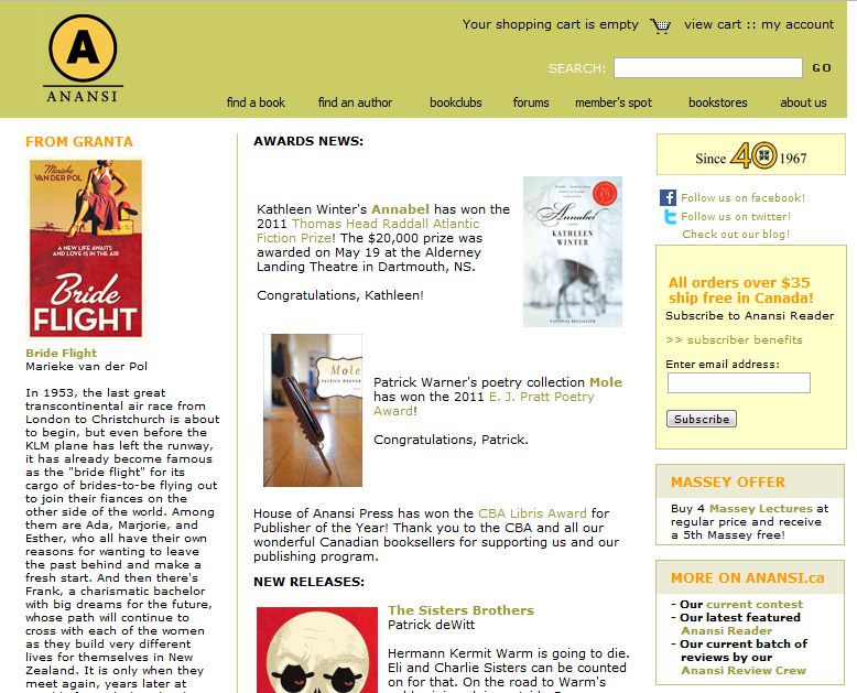
Toronto publisher House of Anansi Press entices visitors to subscribe to its email newsletter by offering information on its latest releases, and exclusive benefits to those who sign up, including free shipping on orders of $35 or more.
It should stand out
To give your call to action its best chance, you should make sure it isn’t ignored. Designers use the core principles of design to make a CTA stand out. Among these useful properties are color, shape, direction, size, value and texture, which you can use in concert to make your message stand out. Many sites use graphics to enhance their CTA.
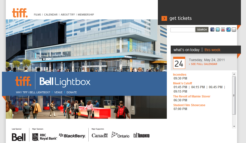
Theatre and film centre TIFF Bell Lightbox makes its call to action, “get tickets”, stand out for a variety of reasons. This message attracts attention because of its location in the top-right corner, its dark value to differentiate it from the rest of the page, its large size in relation to the other messages on the site, and its solid texture that provides contrast to the detail of the photos on the page.
Location, location, location
Placement can have an enormous impact on an call to action’s effectiveness. Placing it at the top of the page, or on the right or left margin can help differentiate it from the main content.
Another important concept is “white space” or “negative space”, meaning the blank area surrounding objects on the page. Empty space can draw attention to content or “positive space”. Not only is this an important design principle, it is also a great way to make your CTA stand out by using negative space to surround it.
Some marketers will say the CTA must be “above the fold”, or visible on the webpage without having to scroll down. It’s true that it’s effective to place the CTA in a location where it will be easily found, but it’s also true that conversion happens at different points for different individuals. The CTA must, therefore, be present at varying points in the interaction. Placing a CTA at the bottom of a page, in fact, can be helpful if you’re easing visitors into your message using words, images, or video.
Put your call to action to the test
In order to find out the overall effect of your call to action, there are services which can run tests on variables. A/B testing is a method in which you can compare different versions of a page using real traffic. Services such as Google Website Optimizer, Optimizely, and Visual Website Optimizer offer user-friendly A/B testing. These services essentially split your website’s traffic between different versions of your site, allowing you to see which one performs best at meeting your website goals.
A case study from Visual Website Optimizer shows how car maker Hyundai optimized its site by testing various elements. The resulting site was able to make the most visitors ask for a test drive or download a brochure.
Original:

Optimized:

There is an art to creating an effective call to action through the use of good design and through understanding your website’s visitors. A/B testing helps you compare each approach quantitatively, giving you clues as to the effectiveness of your call to action.
To learn more about designing an effective call to action, join us at Toronto’s 24-hour blogging festival, Word11.